Nootricious
Brand Refresh & Identity
The Brief
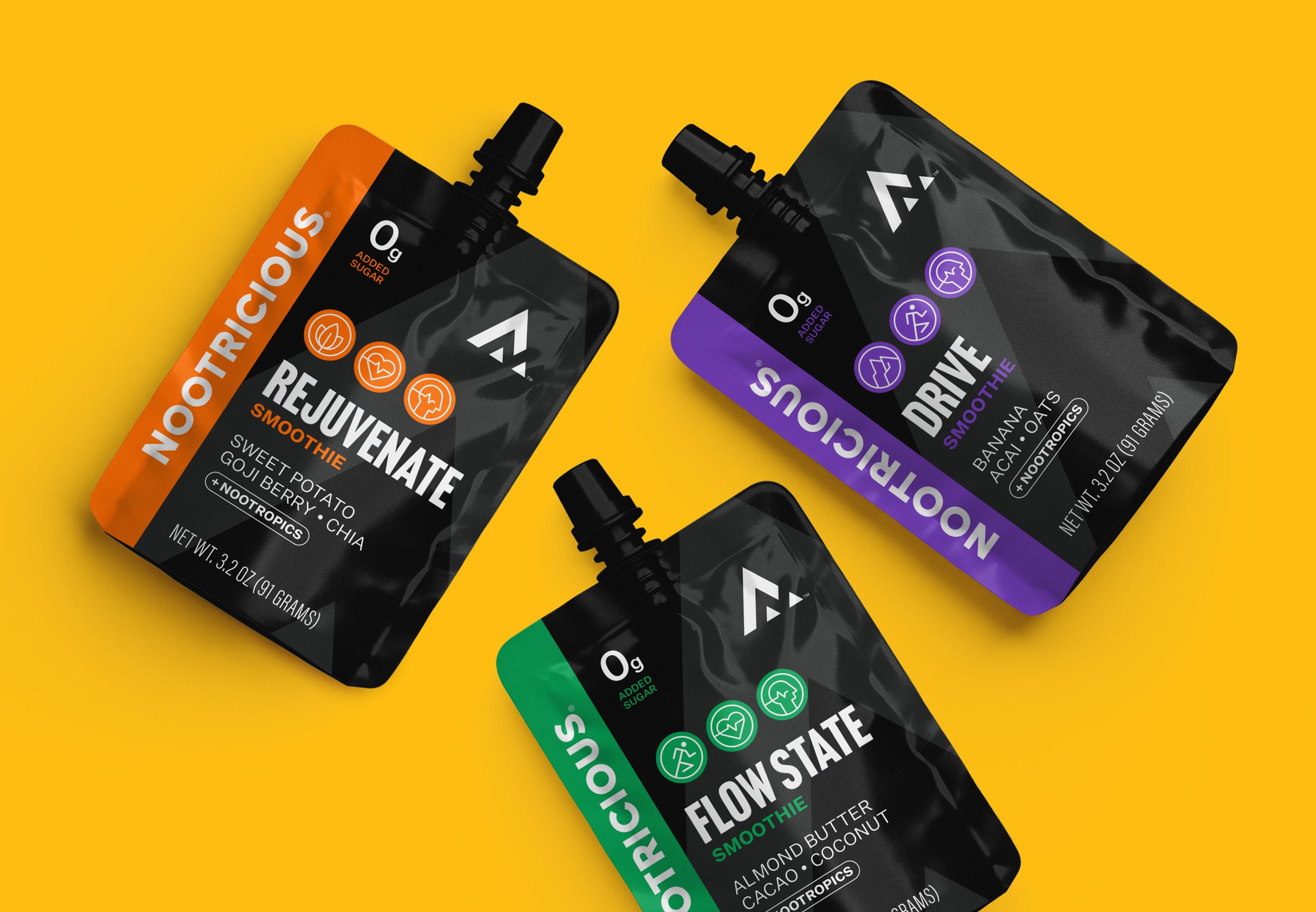
Nootricious is an up and coming sports and nutritional company. They originally approached us about package design, but we quickly widened the scope after realizing their current identity could use a refresh. Matt trusted us and let us guide him through the process, taking well to our recommendations for the brand. He wanted to keep the general concept and meaning behind the brand but let us simplify and create a more iconic iteration.
Our Thoughts
After a quick look at the current brand of Nootricious, we knew there was untapped potential and that the identity had all the elements - it had just been executed rather poorly. We wanted to keep the soul of the original brand, simplify it to only what was necessary, and build off that in a bold and high-end way that would hold up against any sporting goods or nutritional company in the industry, despite Nootricious being such a small company at the time.


Before
Refresh

Before

Refresh

Rationale


Packaging


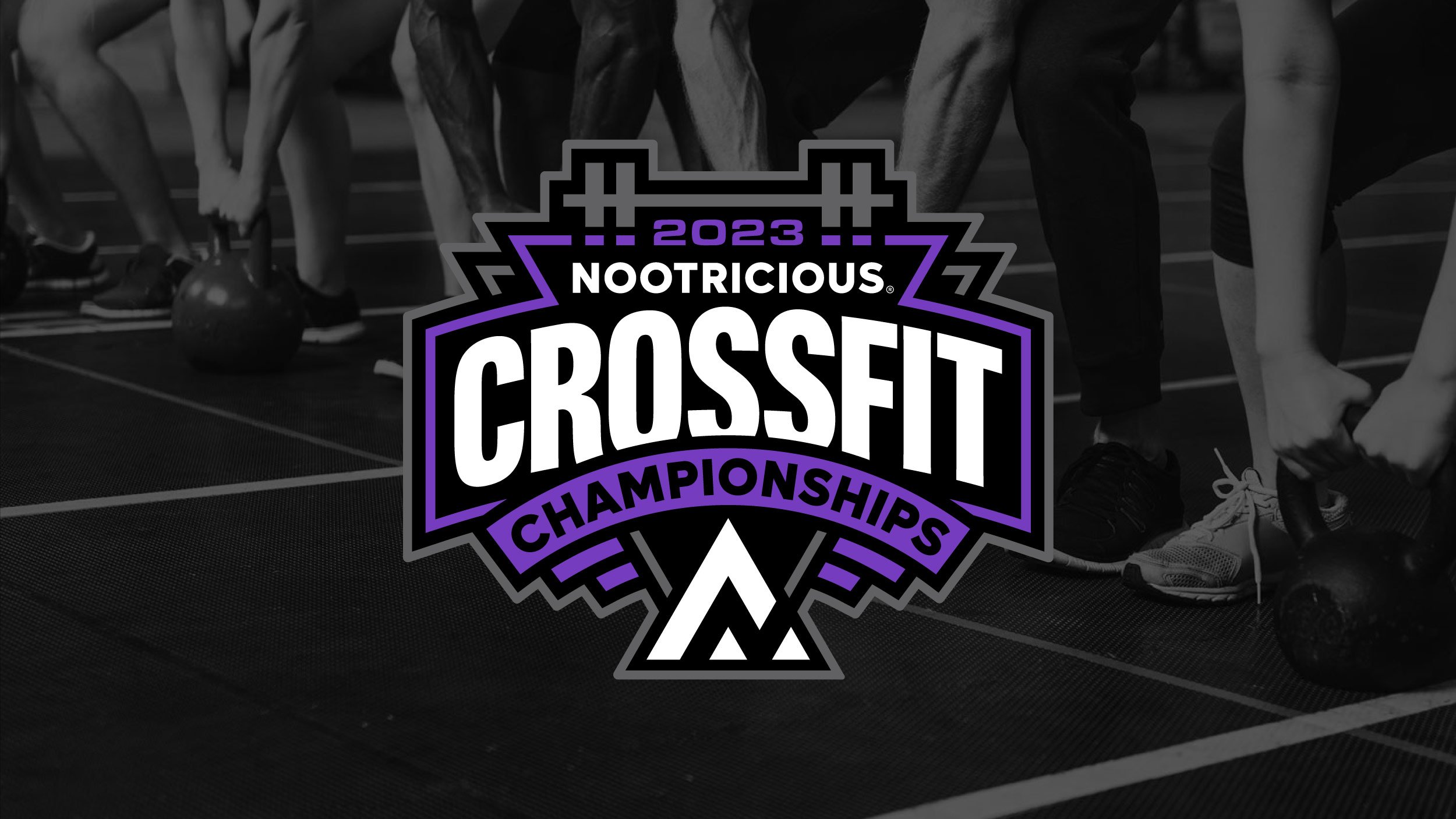
Sponsored Event Branding


