Caffeine Roasters
Brand Refresh & Identity
The Brief
Caffeine approached us with the issue of having an inconsistent brand. Many of the assets had been done by baristas over the years without real knowledge of building out a brand identity system. The packaging didn’t match the cups, which didn’t match the signage, etc. With wanting to expand and open up two new locations, they asked us to create a consistent identity system that could be recognized across locations. The one identifier they wanted to keep was a large C, as they felt they had built brand equity in that through the branding on the cups.
Our Thoughts
We wanted to take any equity in the current brand of Caffeine, modernize it, and build off that in a bold and refreshing way. A few goals we had were to simplify the color palette, keep a large C within the branding as Caffeine wanted, and use consistent typography and design across all touchpoints in a way that could be replicated across locations.

Before

Refresh

Before

Refresh
Attention to detail.

What may look simple at first glance, we spend the time to refine and make precise edits that are more aesthetically pleasing and functional. In this case, we went in and individually curved each letter to match the curvature of the circle. While most would see this is unnecessary, we see it as another opportunity to show attention to detail which reflects across the brand as a whole.
Simplified color palette.

Before

Refresh
Caffeine had a variety of different oranges, both within the logo and across different applications. This can become confusing to customers over time and we wanted to choose a new orange that would remain consistent across all touchpoints and locations. We also adjusted the black and white tones to be a softer, more approachable cream and dark grey.


The lightning bolt is an element we brought in that is a nod to the owner Marius’ previous business. We believe it’s important for logos to tell a story, no matter how simple the concept, and thought this was a great way to tie in his history. It’s also, of course, a great mark to symbolize caffeine and energy.


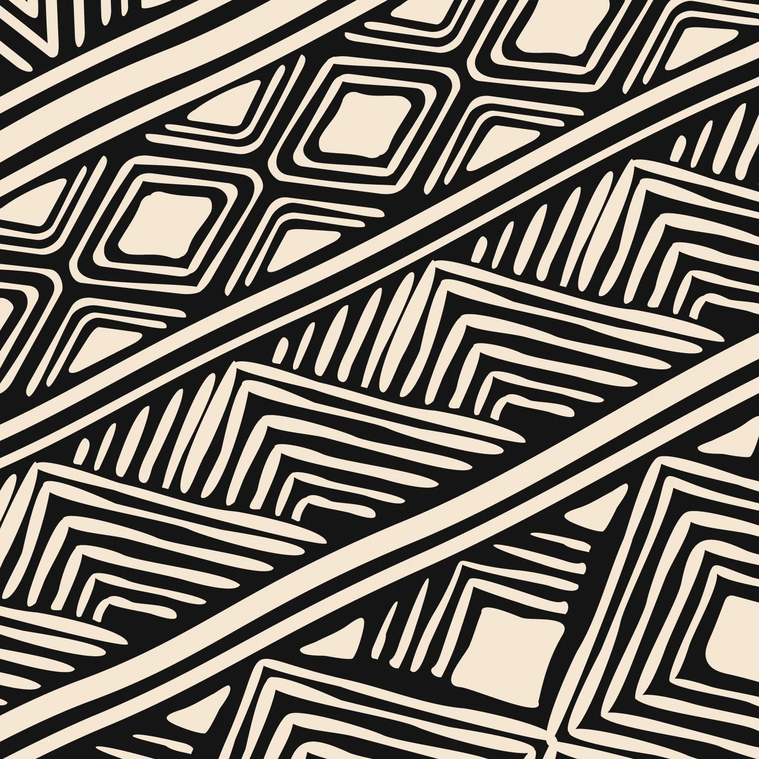
To play off the idea of boldness and energy, we came up with a pattern of circles that radiates off the primary logo. This becomes a recognizable brand element that can be applied in different ways across different touchpoints, like merchandise and drinkware. We also came up with a series of patterns to represent the different countries Caffeine imports beans out of, and incorporate those across packaging.
Pattern play.

Uganda

Brazil

Guatemala

Ethiopia


